One of my most favourite jobs I've ever worked on, this was a new innovative and fun project, that was a brilliant to be involved with.
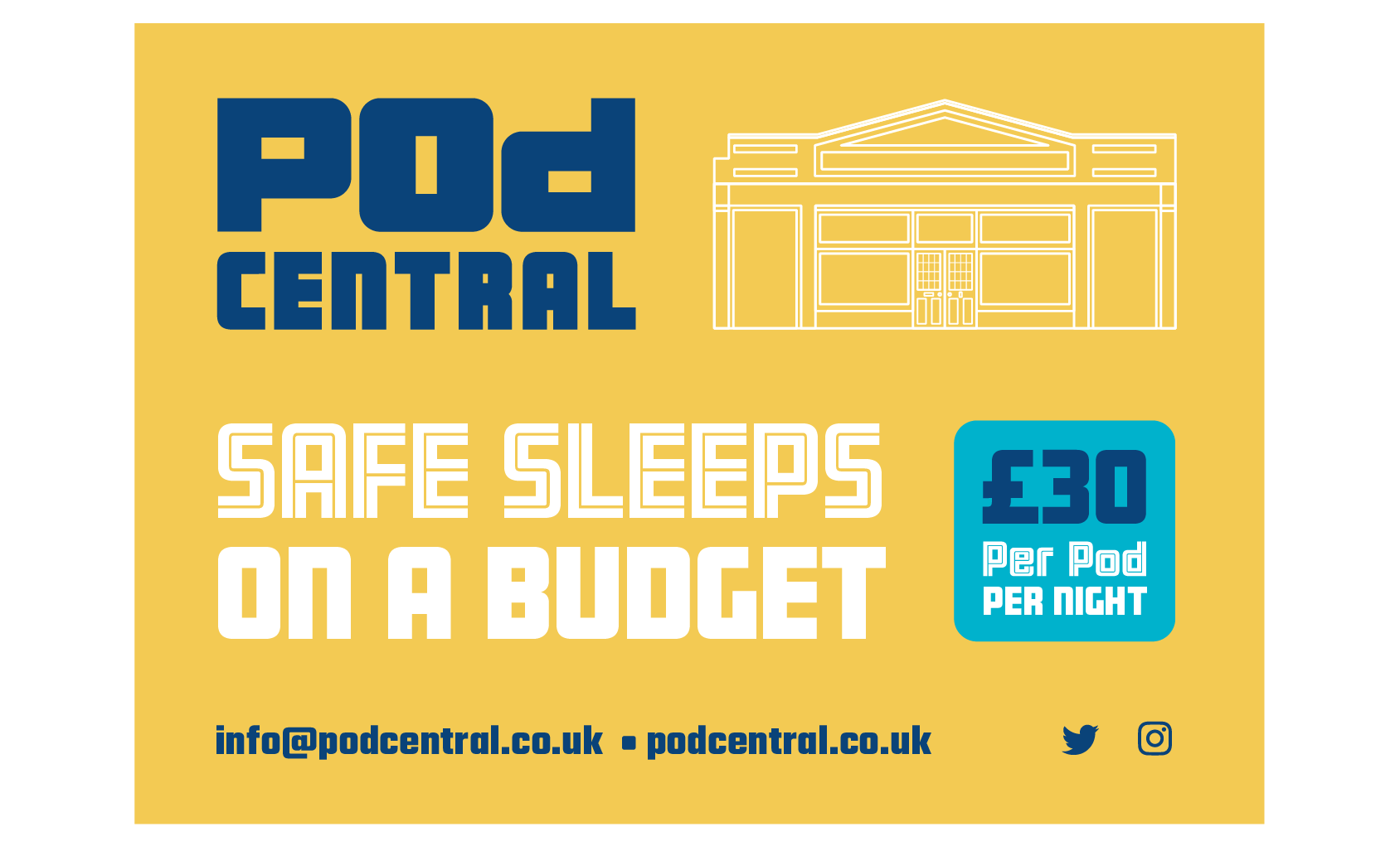
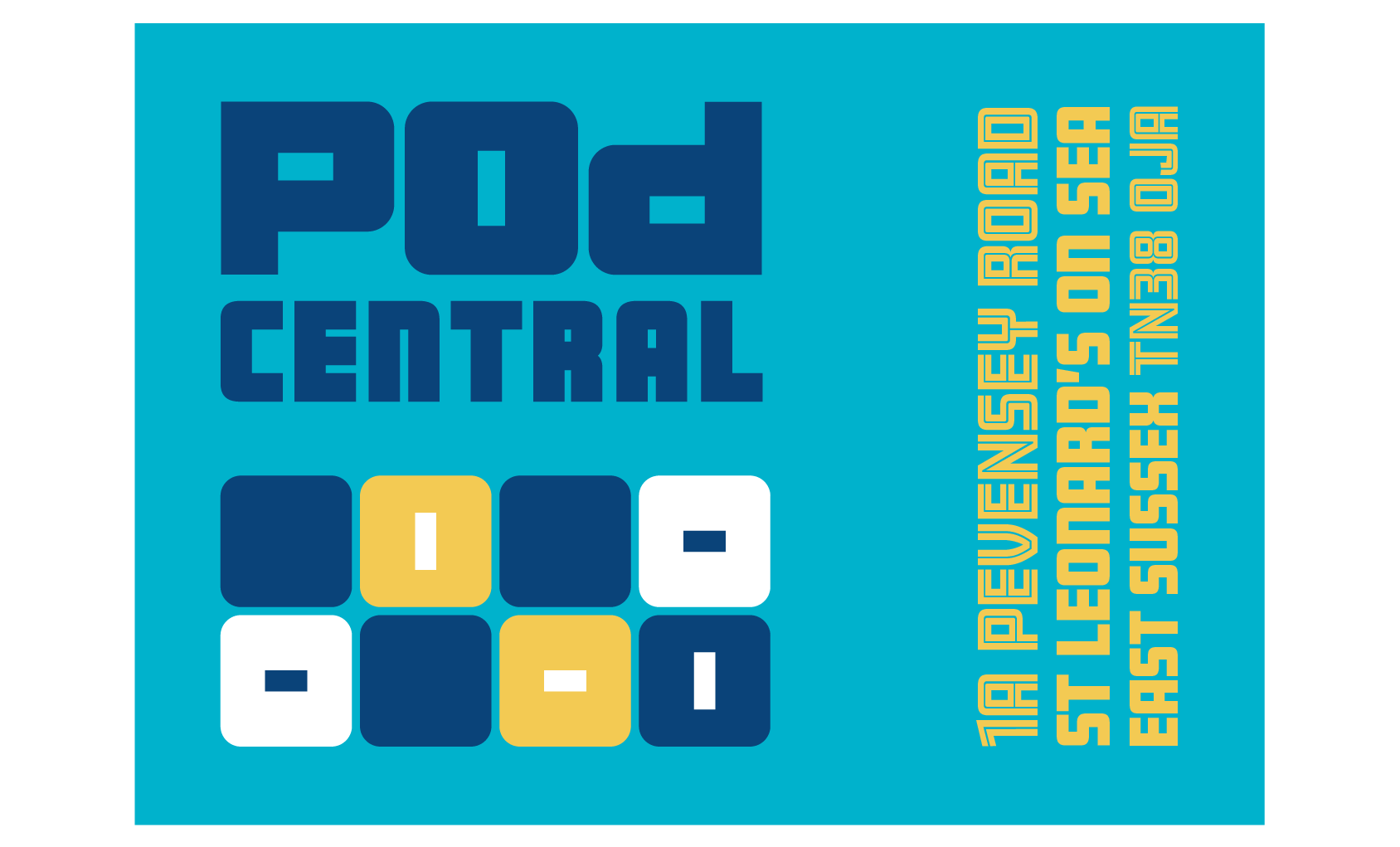
Pod Central is a pod capsule hotel in St Leonards, East Sussex and is accommodation for "safe sleeps on a budget".
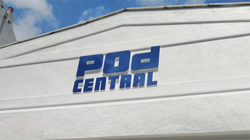
The first stage was creating the logo, followed by developing the visual brand identity, choosing a colour palette, fonts and creating visual graphic devices, one of which is the box pattern. I also drew up the building that is housing Pod Central, formally a shop and is an interesting shape in itself. The drawing was originally intended to be used as a design mockup of signage on the front of the building, but ended up being used as a graphic on the postcard flyers which I designed. This design for the flyers was also used for the vinyl window stickers. The box pattern has worked really well as opaque window vinyls on the top windows to create some privacy whilst keeping to the visual brand identity!
The second phase was creating signage for the pods themselves which involved designing a series of icons in the Pod Central style. Each pod is numbered and each guest has a numbered locker, plus for the comfort of all guests, there are a few guidelines for using each pod! These icons have also been used for stickers for the lockers and bins, and guidelines for using the shower. As eco friendly accommodation, they don't want water wasted and are keen to make sure rubbish is recycled!
Visit www.podcentral.co.uk to find out how to book a pod!